


Housing affordability around the globe and what really helps

Whinging is a national sport here in the UK, but if there is one area where I think all the complaining is justified it is about house prices in London and other high price areas of the country. Famously, a guy paid £25,000 last year for a staircase in London that isn’t even in use. But when it comes to housing affordability, it is difficult to compare data across countries because the methodologies differ so much. But that may be about to change.
Nina Biljanovska and her collaborators have released an analysis of an experimental dataset on housing affordability across 40 countries. While they stress that this data is preliminary and should be interpreted with caution, I will stick my head out here and discuss two results of their analysis.
The good thing about the new dataset is that it does not simply divide the median house price by the median income as is done so often in the press but instead looks at mortgage interest rates, the average loan-to-value ratio of a mortgage and the necessary annual income to qualify for a mortgage as well. Hence, it takes access to mortgages and the interest burden of mortgages into account as well.
This methodology shows that in the aftermath of the financial crisis 2008 housing affordability has increased in most countries because of the low interest rates on mortgages. Furthermore, it shows that when you look at national averages (i.e. not just at high price places like London or Paris), the UK isn’t that bad. The chart below shows that housing affordability is lower than in the UK in places like Australia, France, Italy, Germany, and even Greece. However, housing affordability is higher in countries like the US, Japan, Canada or Sweden. Indeed, the UK is roughly middle of the pack in terms of housing affordability.
Housing affordability in 40 countries
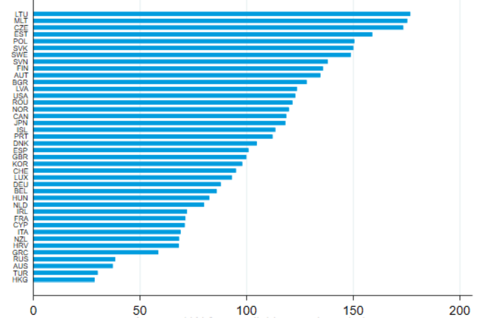
Source: Biljanovska et al. (2023)
But these averages hide a starker reality in high price areas like London, Paris, Vancouver, and other cities plagued by insufficient supply of homes. And this is where the second result of the study comes in. There is some evidence that the best way to improve housing affordability is government intervention. The charts below show that while the increase in housing affordability may not be statistically significant, increasing housing benefits for lower income households can increase affordability by some 4% while building additional new homes can increase affordability by some 2%. Good housing policy then attacks the problem from two sides. It supports housebuilders in their efforts to build more homes and it supports lower income buyers in their access to affordable mortgages.
Impact of government spending on housing affordability

Source: Biljanovska et al. (2023)
This chart is not taking into account the price fluctuations between rural and urban environments. In places like Lithuania it is HUGE since population is gathered in 2 main cities. There, cost of a new built apartment is the same as a city in the UK or Coppenhagen. But as soon as you leave the 1 hour drive time radius, property costs reduce dramatically because rural and even suburban areas are lacking basic infrastructure, like healthcare and lifestyle facilities. Other countries might have similar nuances; it would be great if data considered that.
In the chart... polarity... Higher figure = more affordable?
Lithuania is affordable and Hong Kong is unaffordable, yes?
(Rather than the figure for each country being some measure of the cost of buying a property)