


The economic impact of maps

Maps have long fascinated me, but to my embarrassment, I have never really thought a lot about the economic impact they have.
Of course, maps have long been used as a political instrument. The most infamous cases are maps of electoral districts in the United States that have been heavily gerrymandered to favour one party or another. And even though we now can easily quantify how big the partisan impact of gerrymandering is in a state, the US Supreme Court refuses to rectify the situation. The result is that now, the Republican Party has a distinct advantage in national elections which is why both Donald Trump and George W. Bush could become President with a minority of the total votes cast.
Outside the United States, the political consequences of maps have been even more harmful. The British Empire expanded its geographical reach not so much with the cunning use of flags as Eddie Izzard claims, but with the help of colouring areas pink that they did not really control (pink being the colour used in Imperial Shipping Maps to denote areas of British influence).
Once the British Empire had to give back control to now sovereign nations, they simply drew straight lines with a pencil on maps to delineate the new territories. The Sykes-Picot line separated the Middle East into English and French spheres of influence. Unfortunately, the line was drawn without any consideration for religious or ethnic boundaries, which is why the Kurds did not get their own territory and were mixed together with Shia and Sunni Muslims in arbitrary regions. These regions later became modern nation-states like Syria and Iraq that to nobody’s surprise have been mired in conflict for a hundred years now.
The Sykes-Picot Agreement and modern nation-states in the Middle East

Now there is a fascinating article in the latest edition of the Journal of Economic Perspectives that looks at the economic consequences of maps and I encourage everyone to read it. In it, the authors explain how Christopher Columbus used the Martellus Map of 1489 as part of his push to explore a westward route to India. The problem with the Martellus map is that it incorrectly enlarged the East-West dimension of the Eurasian continent to span 220° instead of 130°. Thus, the westward journey to Japan and India looked much shorter than the eastward route known at the time. Without that mistake, Columbus might not have discovered the Americas, they would not have become a Spanish colony, the gold and silver of the colonies would not have been able to finance Spanish hegemony, and the economic and political fortunes of Spain would have been vastly different.
It is easy for us to mock inaccurate maps of hundreds of years ago, but modern maps have economic consequences, too. While both Google Maps and Apple Maps have the same data on roads, buildings, etc. the companies’ algorithms determine which points of interest are highlighted when the user zooms in and out of these maps. As Justin O’Beirne shows, Google Maps emphasises transit and transport hubs such as train stations, while Apple Maps emphasises points of interest like tourist spots and restaurants. Obviously, this means that it will likely take you longer to get from A to B if you use Apple Maps, but it also makes it easier for you to find the nearest restaurant or department store. But which restaurant or store Apple Maps highlights is also important. Another study showed that restaurants that were not included in Yelp had on average 5% to 12% lower revenues than similar restaurants nearby that were included in the App. In a notoriously competitive industry like restaurants, this can make the difference between a flourishing business and ruin.
The same view of the London West End in Google Maps and Apple Maps
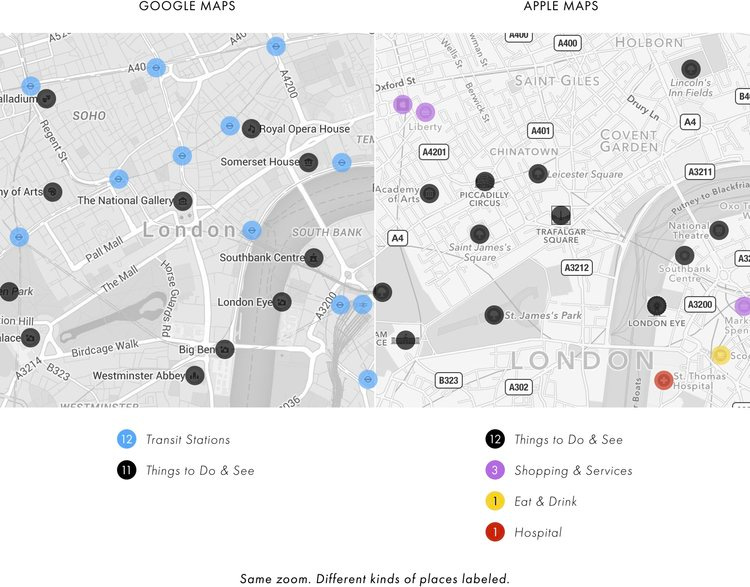
Source: Justin O’Bierne.
Because maps and the data they show to users have become economically important, they also have become big business. Licencing fees for Google Maps, TomTom maps or other high-quality maps can easily go into the millions. Unfortunately, the map business is riddled with a lack of competition because a few players dominate each step of the value chain. Reducing licencing costs can have unintended consequences. The electric car maker Tesla originally used Google Maps for its navigation system but changed to cheaper open-source software throughout the 2010s. This means owners of an expensive luxury car now use software that can compete with Google Maps in big cities and affluent areas (where most of these cars are driven) but have a serious lack of information in less populated and rural areas where open-source maps just are not as detailed as Google Maps or other commercial providers. The result were strange routing decisions by Tesla’s navigation system that sent drivers several times over the same highway intersection simply because the data in the system was not precise enough.
The list goes on but the lesson is clear. Maps reflect choices made by the maker of the map. And these choices are dominated by the incentives the maker has, be they political or economic. As a result, maps can have a surprising influence on the economic fortunes of businesses and our own choices, both positive and negative. It is fascinating to read about these influences in the Journal of Economic Perspectives.