

The investor’s fallacy – A comment

On 14 January, Nick Magiulli who runs the blog Of Dollars and Data published a post titled The Investor’s Fallacy. In it, he shows nicely that prior 10-year returns of the S&P 500 have almost no correlation with future 10-year returns (he calculates a slightly negative correlation of -0.19). But then he produces a chart that I have copied in below. In this chart the trailing 20-year return of the S&P 500 (total return in nominal terms) has a significantly negative correlation of -0.83 with future 10-year returns.
Nick is careful to note that this does not mean that $1 invested today will necessarily be worth $4 to $5 in 2030 but he also shows that if we assume a mere doubling over this decade it would be a massive negative outlier. And of course some bullish pundits have used this chart to claim not only that fears of low returns or even a lost decade are overdone. They have claimed that investors should expect very high returns indeed.
I do not want to offend Nick because I think he is a smart thinker and his blog is a good read and worth subscribing to, but to me the chart above doesn’t pass the smell test. The contrast with a 10-year look-back period where no correlation can be found is just too big. Why should such a strong negative correlation appear out of nothing just by extending the look back period to 20 years? Furthermore, if I assume $1 invested today will be worth $4 in 2030, then the 20-year average return from 2010 to 2029 will be 14.1%. Historically, we have seen such high returns only in the run-up to the tech bubble of the late 1990s. It’s not impossible, but it also seems not very likely.
I was worried that this chart of Nick might be a case where two of my pet peeves about finance conspire. The first one is that many results in finance cannot be independently reproduced, a phenomenon that has led to a replication crisis in science as I have written here. The second one is that many biased pundits tend to take data that supports their case and then run with it without critically questioning its validity. Could the chart above be a case of something that looks too good to be true?
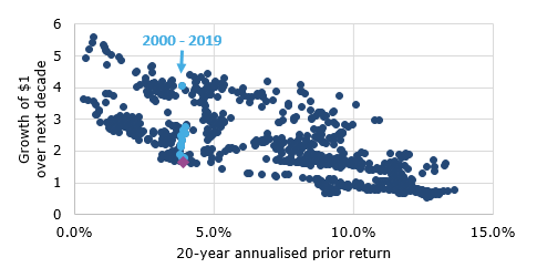
The first thing I did was try to replicate Nick’s chart above. I don’t have access to the Returns 2.0 software from DFA but luckily, Prof. Robert Shiller makes S&P 500 index data available back to 1871 on his website. The Returns 2.0 data starts in 1926, so I came up with the chart below based on the data provided by Prof. Shiller. The dark and light blue dots are my effort at independently replicating Nick’s chart above. I have also added the data point we wold get in 2030 if the S&P 500 were to double between today and then. It becomes clear that a mere doubling of the S&P 500 would lead to a significant outlier in the chart.
Overall: I am glad to say that my results are extremely similar to Nick’s and I, too, get a correlation of -0.83 between prior 20-year returns and 10-year future growth of $1. Replication crisis averted. Nick’s analysis seems genuine.
S&P 500 10-year future growth based on 20-year prior return

Source: R. Shiller (Klement on Investing). Data from 1926 to 2019. Note: Purple diamond indicates the data point if the S&P 500 would double from current levels by 2030.
However, using the data of Prof. Shiller instead of the DFA data has two advantages. First, because the Shiller data starts in 1871, I can extend it further into the past by several decades. If I plot the same chart with data starting in 1871 (hence the first 20-year period ending in 1891), it looks like this:
S&P 500 10-year future growth based on 20-year prior return

Source: R. Shiller (Klement on Investing). Data from 1871 to 2019. Note: Purple diamond indicates the data point if the S&P 500 would double from current levels by 2030.
Suddenly, it doesn’t seem so likely that the S&P 500 will quadruple over the next ten years. In fact, given the total return of the S&P 500 over the last 20 years, the next decade can bring anything from no return at all to a quintupling. It seems like this is a similar case to the models on US house prices used before the financial crisis that showed that, nationwide, “house prices don’t drop”. Insufficient historical data can lead to spurious correlation.
I can already hear the equity bulls complain that going back to the 19th century is not relevant since markets were very different back then. So, instead of going back to 1871, let’s keep the time frame of the data the same as Nick’s and start in 1926. But instead of looking at nominal returns, let’s look at what really matters for investors, namely real returns. The chart below is the same chart as my first chart (or Nick’s chart for that matter) but this time I have adjusted returns for inflation. In order to calculate where the S&P 500 would be in 2030 if it were to double in this decade, I have assumed that inflation in the United States averages 2% per year throughout the 2020s.
Again, we see that a doubling of the S&P 500 in nominal terms (which would turn $1 to $1.66 in real terms) would be at the low end of the historical experience but by no means extraordinary.
S&P 500 10-year future real growth based on 20-year prior real return
Source: R. Shiller (Klement on Investing). Data from 1926 to 2019 adjusted for inflation. Note: Purple diamond indicates the data point if the S&P 500 would double from current levels by 2030 with an average inflation rate of 2% in the 2020s.
Last, but not least, Nick is right to point out that this entire analysis so far suffers from one major weakness. It uses overlapping data instead of non-overlapping 20-year periods. We all use overlapping data in finance all the time simply because historic data is limited and we have to make do with what we got. But if you use overlapping data, you use autocorrelation in the time series. While this is not always a problem, it does significantly impact your estimates of correlation and covariance between two variables. There are ways to correct for overlapping data, some of which are described here, but I won’t dive into the depths of econometrics here.
Instead, I did a simple experiment. I calculated the correlation between prior 20-year returns and future 10-year growth of $1 using non-overlapping data. Obviously, if I do that I have only a handful of non-overlapping data points if I start in January 1871 (when the Shiller data begins). But what if I start in February 1871? Or in August 1887? So what I did was to calculate the correlation for every month between January 1871 and December 1890. This way I get 240 correlations, each of which is based on non-overlapping data. I can then compare these correlations with the correlation derived from overlapping data.
Correlation based on overlapping and non-overlapping data

Source: R. Shiller (Klement on Investing). Data from 1871 to 2019.
Depending on the starting point for my non-overlapping data, I get a correlation between -0.78 and +0.73. Note that the estimated correlation using the overlapping data was -0.83 and lower than all the estimates from non-overlapping data. If I look at the chart above, I would say that the true correlation is probably slightly negative but somewhere close to zero. And a zero correlation means that indeed, as Nick says “Markets are never ‘due’ for anything”. They are not due for a bear market or a lost decade, but are also not due for double digit returns.